
This re-brand wasn’t just about updating the logo or picking out some fresh fonts. Standard Iron needed more than a new brand identity, they needed a launch pad for expansion. One that could carry their legacy of craftsmanship into a future defined by growth, scale, and partnerships. We worked with them to build a bold new foundation that is strategically positioned, visually powerful, and ready for what comes next.

Positioning the New Standard Iron
Our first task? Help define who Standard Iron is becoming.
Following their acquisition of Helgesen and the expansion to seven global manufacturing locations, Standard Iron needed a brand story that went beyond “metal fabrication”. What emerged from the voice of customer research was a positioning rooted in strategic partnership: a company that co-engineers solutions, empowers its workforce, and builds resilient, intelligent supply chains.
We distilled this ethos into a brand platform that’s both aspirational and practical—built for what’s next, without forgetting what came before.
A Logo that Leans Forward

The new Standard Iron logo is a visual metaphor for the company’s evolution. Strong geometry, industrial grit, and purposeful symmetry come together to form an abstract “S” that represents not only Standard Iron, but also strength, structure, and forward momentum of the company.
The bold red and iron black palette was retained but refined, grounding the brand in its roots while modernizing its presence.
A versatile badge was also designed to be worn with pride by the people who keep Standard Iron moving, because rebrands don’t just happen on websites and brochures, they’re made real in breakrooms, welding bays, and engineering huddles.
A Tagline That Tells the Truth
With the change in positioning, DKY recommended a tagline. One that isn’t just catchy, but rings true for employees, partners and customers alike.

We developed the tagline “Stronger Together. Smarter for You.” to encapsulate the dual promise of the brand: unity across teams and geographies, and a relentless drive to create value for OEM partners.
Whether you’re a welder on the shop floor or an engineer across the table, this line speaks to the shared mission of building something better—together.
The Digital Refresh
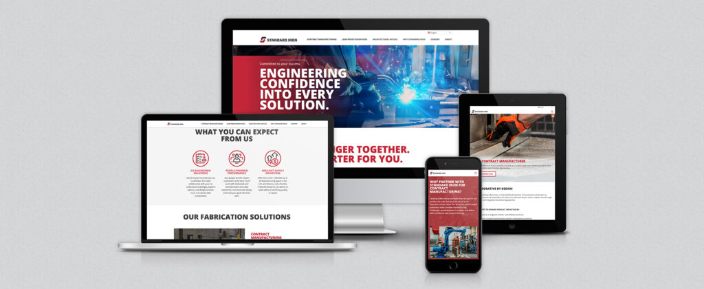
We led the overhaul of Standard Iron’s digital experience through a phased approach. Phase one focused on updating the existing site with new messaging and a refreshed identity that matched the momentum of the brand.
Phase two went deeper, with a backend rebuild on WordPress to make the site easier to maintain and ready to scale with future growth and acquisitions. The new experience not only helps prospective clients quickly understand Standard Iron’s capabilities, but also makes it easier to attract top talent by showcasing company culture and simplifying the application process.
More Than a Makeover
Rebrands can sometimes feel like surface-level polish. This wasn’t that. This was cultural. Strategic. Essential. As Brian Hazelton, CEO of Standard Iron, put it:
“This is more than a new look. It’s a declaration of who we are.”
We’re proud to have helped write that declaration. And if your brand is facing a moment of transformation, let’s talk.
